
In learning anything to do with programming it often helps to have a motivating factor to invest time and effort into developing a particular programming application.
I have long found Python to be a very valuable tool with regard to spectrum analysis and image processing in developing remote sensing technology using modified drone cameras equipped with customised filters.
The science of acquiring images which contain information, such as near-infrared imagery, involves the development and testing of specialised optical filter technology for use in modified cameras for imaging.
The 2 filters developed for this purpose are essentially dual bandpass filters, made of high quality glass, with different transmission characteristics in the near-UV to blue band and Near-infrared band.
They are circular filters embedded in a custom housing for use with the Mavic 2 Pro Hasselblad Camera.
Filter#1

Filter#2

They are circular filters embedded in a custom housing for use with the Mavic 2 Pro Hasselblad Camera.
Filter#1

Filter#2

Measuring the spectra of the optical filters is critical for defining their application in the field.
We can measure the characteristic spectra using a visible wavelength optical spectrum analyser (OSA) and read the data into a plot in Python showing the dual-bandpass nature of the filter at 2 critical wavelength regions.
We can overlay 2 sets of data from 2 filters and compare the 2 in the same wavelength regions
Both Types of Filters for sale here:
https://www.ebay.ie/itm/155859816325
https://www.ebay.ie/itm/155859834544
We can also study the color histogram of the image taken by comparing an image taken without a filter and and image taken using the different filter types.
With No Filter:

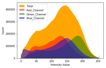
With Filter #2:


This information is useful in constructing radiation indices for identification of quantifiable objects in an image, which is key in the practice of quantity surveying using remote sensing techniques.
As we can see using the filter the green channel is greatly diminished and we can leverage the amount of Red detected (which is NIR using our filter) with the Blue using our formula to get the modified NDVI, giving a way to quantify the vegetation density in a photographed and/or mapped region.


We can also plot the Red channel (Our NIR) vs the Blue Channel (Our Visible Leverage) to get a characteristic soil and wet edge profile, a kind of correlogram, which is very useful as a remote classification tool.

The data in the scatter plot has a particular pattern however it is really too dense to properly interpret. A solution to this is to create a hexagon bin plot.

we can tidy up our plotting further by using the gaussian kernal density function. This also helps prepare the plot for further study as we shall see.
To begin we need to flatten the data from a 2D pixel array to 1D with length corresponding to elements (Warning! this can take some time). the fastest way to do this is to use the python library-level function ravel, which reshapes the array and returns its view. Ravel will often be many times faster than the similar function flatten as no computer memory needs to be copied and the original array is not affected. *
With added shading we get an easier graph to view and work with overall:

With the ability to place a contour around certain regions of the plot we can then have the ability to link the spectral content with the spacial content in our image analysis.
First we can define a threshold for our NDVI and plot it to see the NDVI levels marked above this threshold if we wish

Next we can place a contour over the spectral region that the threshold mark corresponds to in the NIR vs Blue spectral graph.

We can interpret this ourselves and classify the spectral analysis using established knowledge of its features. This is the beginning of developing a kind of classification system based on this linked information.
We can also classify using other means such as plotting the pixels located between the dry and wet wedges to indicated where mixed vegetation could be.
Going futher down this path leads to exploring other tools such as clustering algorithms, support vector machines, neural networks and the like as we approach the cusp of the field of machine learning with our spectral information which is a valuable technology in and of itself. This deserves its own series of articles with regard to combining drone-based remote sensing with machine vision tools, particularly some of those features in use in the QGIS toolboxes, such as Orfeo.
Interesting still is the fact that indices beyond the NDVI can be developed and studied using these scientific plotting techniques using new filter designs to explore new potential environmental markers. An Ultraviolet-based environmental index using UV-remote sensing cameras is already under development for use in land and marine applications, taking advantage of the ability of UV light to penetrate the air-water barrier and return useful reflectance image information which we will be exploring in the near future.
As always the code is available on the GitHub page and is open for customisation and tinkering for each persons own needs: https://github.com/MuonRay/PythonScientificPlotting
Notes:
* see reference to this at pages 42-43 @ Numerical Python: A Practical Techniques Approach for Industry By Robert Johansson


